

Updated May 9, 2026
You asked, and I’m delivering! My paint colors are hands down one of the things I get asked about the most, so I’ve created the ultimate reference guide to every single shade I’ve used across my homes. From the living room to the bedroom and everywhere in between, it’s all right here!
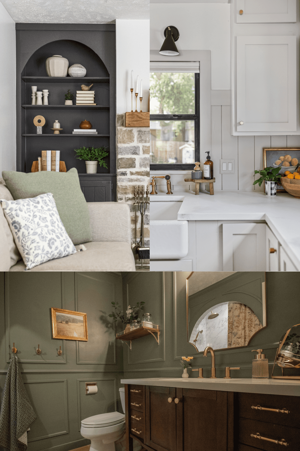
Table of Contents
My Home Paint Color Philosophy
When choosing paint colors for my home, I’m a firm believer in keeping things classic and cohesive, which means I tend to reach for neutrals, grays, and greens over and over again. Sometimes the perfect color is waiting for me right on the card at Sherwin-Williams, and other times I have to create something custom to get exactly what I’m envisioning.
For the standard Sherwin-Williams or Benjamin Moore colors I’ve used in my home, I’ve listed the color name and number, and for custom colors, I’ve included a photo of the paint can label with the full formula. Take that into your local paint store, and they can mix it right up for you.
The Neutral Paint Colors I Love
Sherwin-Williams Accessible Beige (SW 7036)
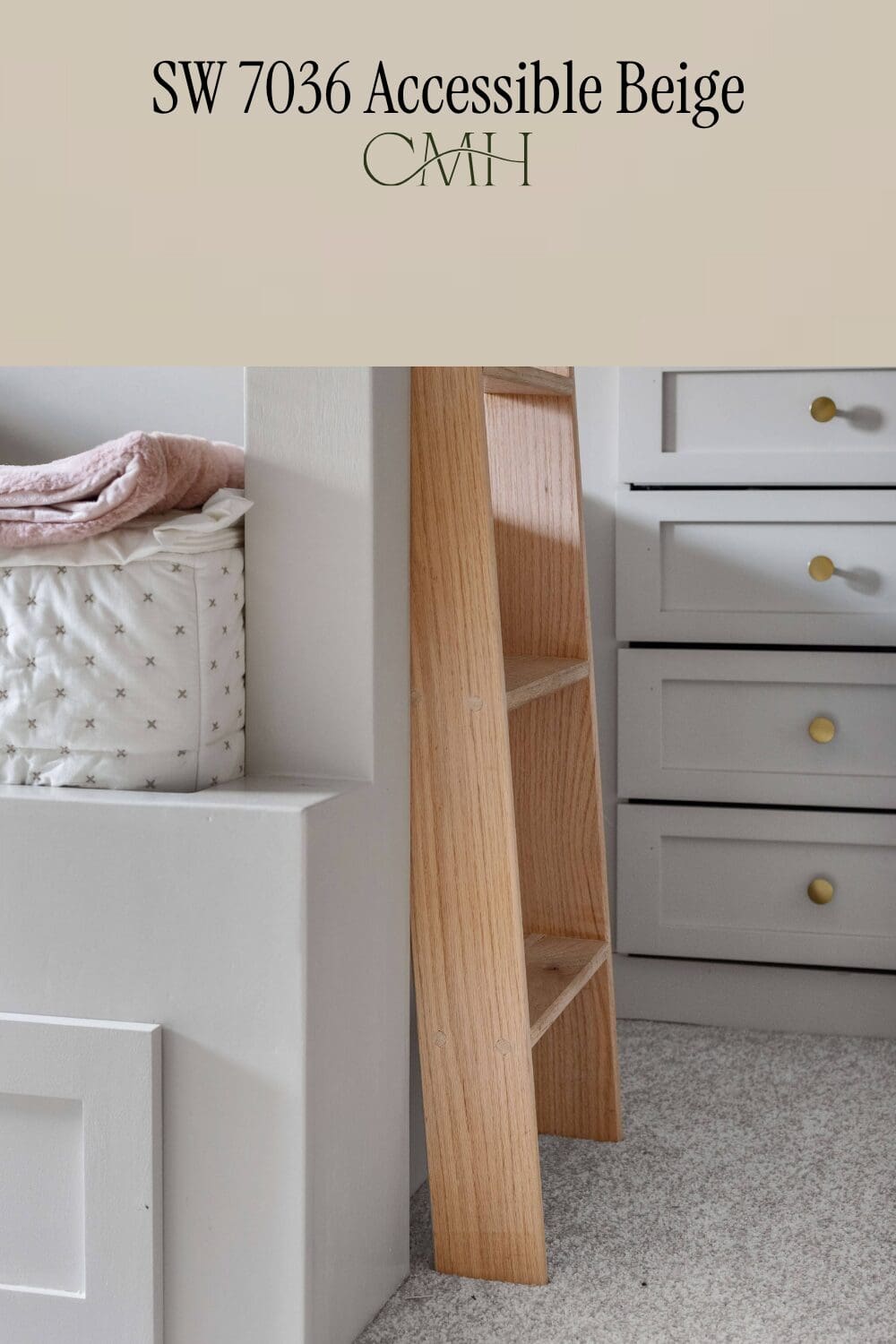
If I had to pick just one home paint color to use for the rest of my life, Accessible Beige would be it. This color is the ultimate neutral. It’s not too grey, not too tan, and somehow manages to look absolutely perfect in every single space I’ve put it in. It’s warm without being too yellow, grounded without feeling dark, and it plays beautifully with just about any accent color or wood tone. Once I discovered Accessible Beige, I started using it everywhere, and I mean everywhere!
Where I’ve Used Accessible Beige:
- St. Louis
- Omaha
- Primary Bathroom Shiplap Walls: How to Install Vertical Shiplap Walls in a Bathroom
- Primary Bathroom Upper Cabinet: DIY Counter Cabinet for Extra Bathroom Storage
- Entryway Coatrack: Easy DIY Wall Coat Rack for Entryway
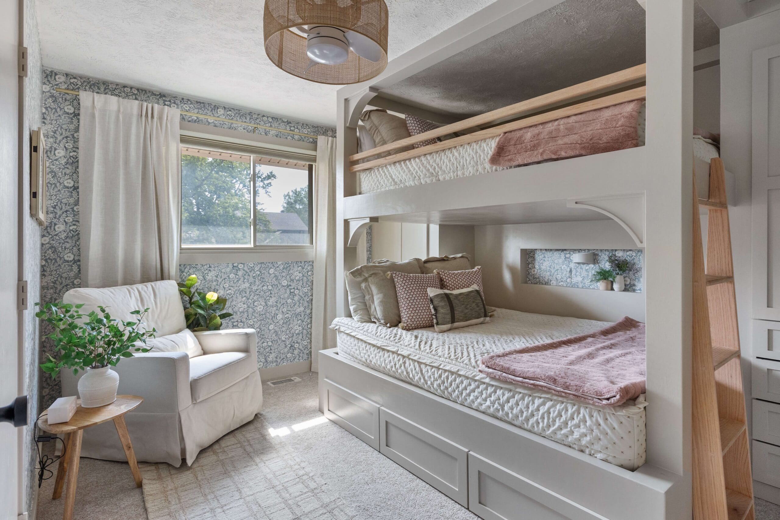
- Girls’ Room Bunk Beds: DIY Girls’ Bunk Beds and Decor
- Command Center: How to DIY a Family Command Center
- Kitchen Backsplash: Beautiful DIY Shiplap Backsplash
- Kitchen Upper and Lower Cabinets: Making Unfinished Kitchen Cabinets Look Custom
- Doors and Trim: How to Upgrade Interior Doors – Affordable DIY Door Makeover
- Provo
- Basement Kitchen Cabinets: DIY Refurbished Kitchen Cabinets for an Affordable Kitchen Remodel
- Upstairs Kitchen Lower Cabinets: #1 Fastest Way to Paint Kitchen Cabinets
- Brother and Sister-In-Law’s House
- Living Room (lightened 50%): How to Design a Formal Living Room for Style and Coziness
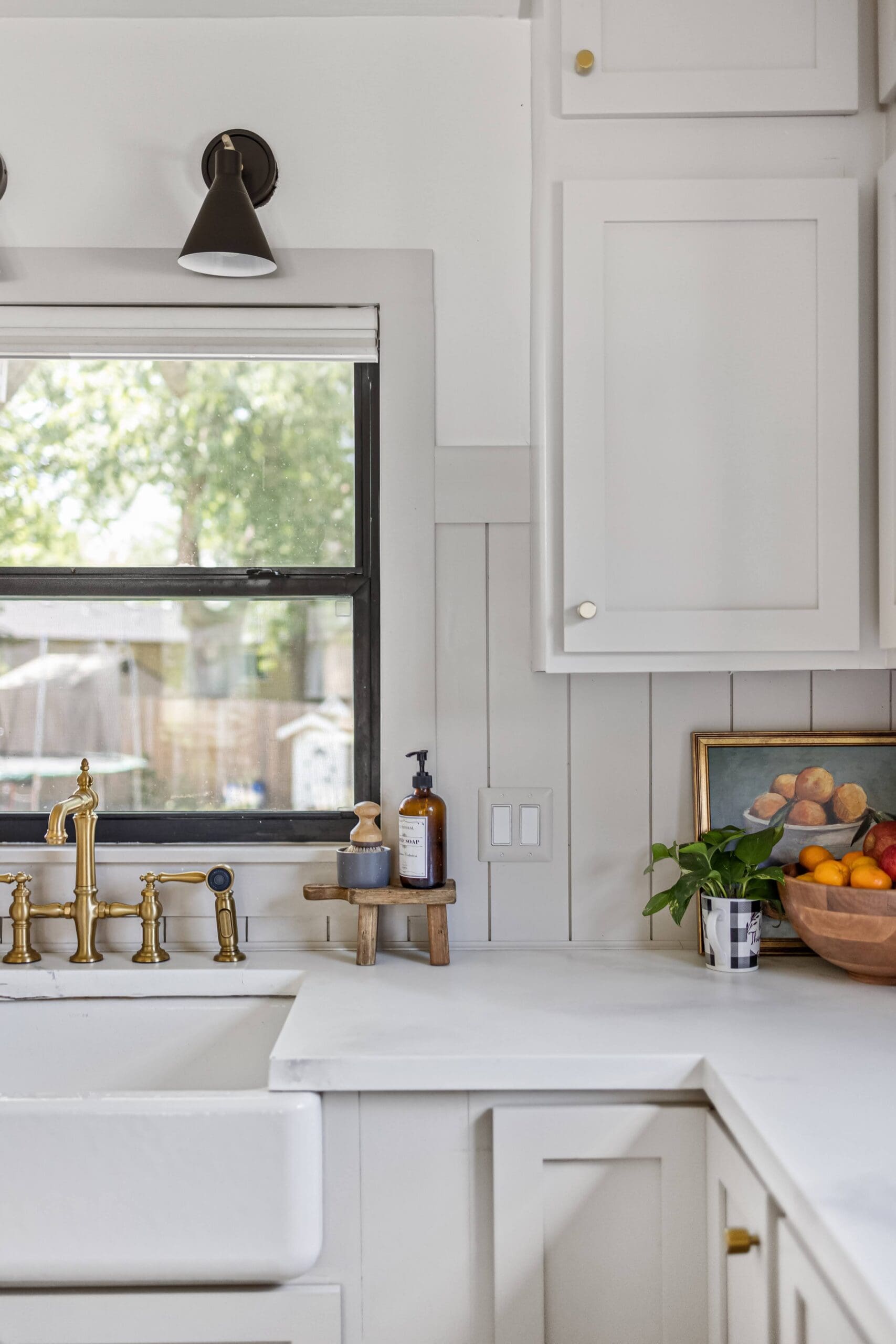
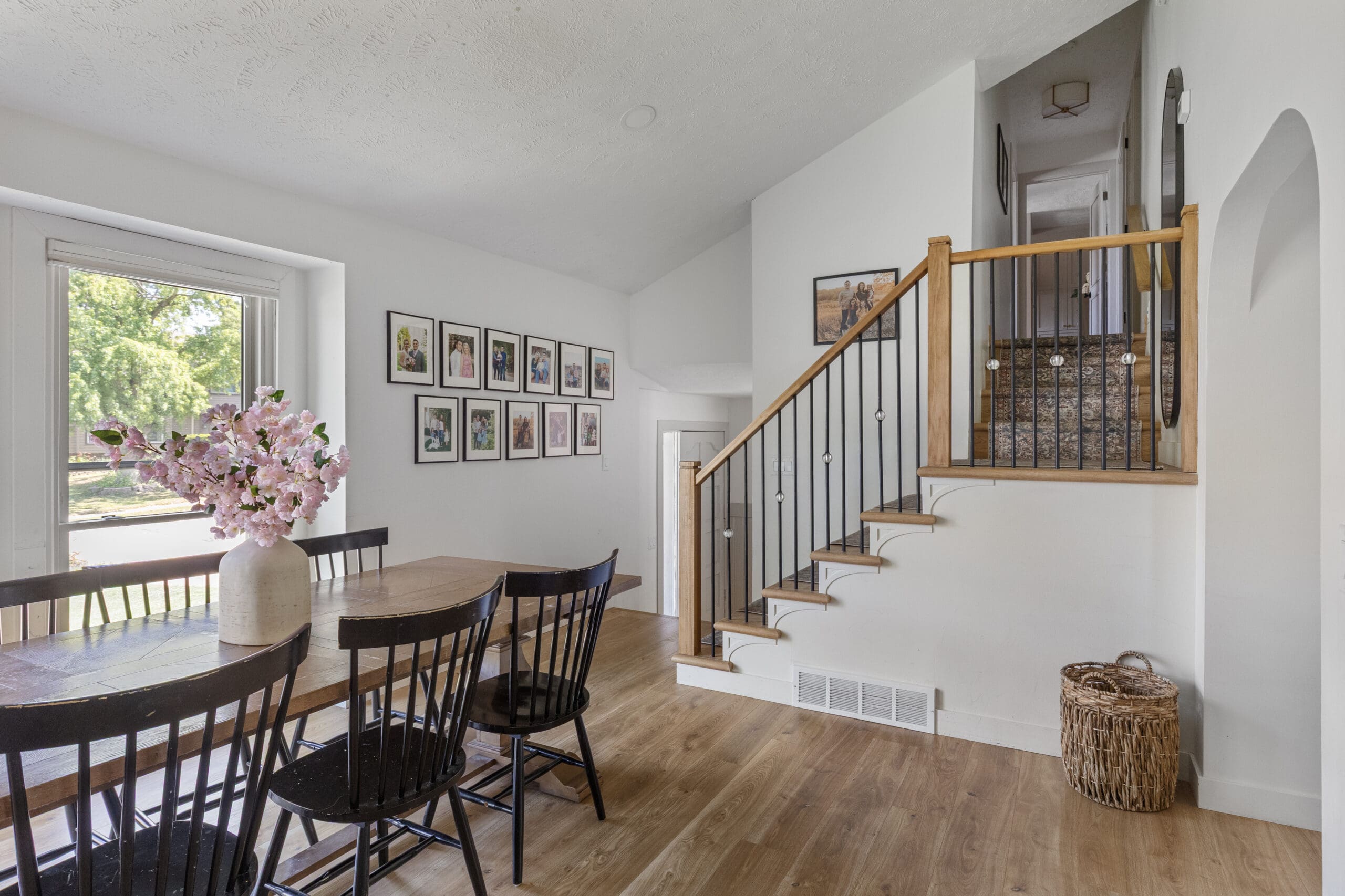
Sherwin-Williams Alabaster (SW 7008)
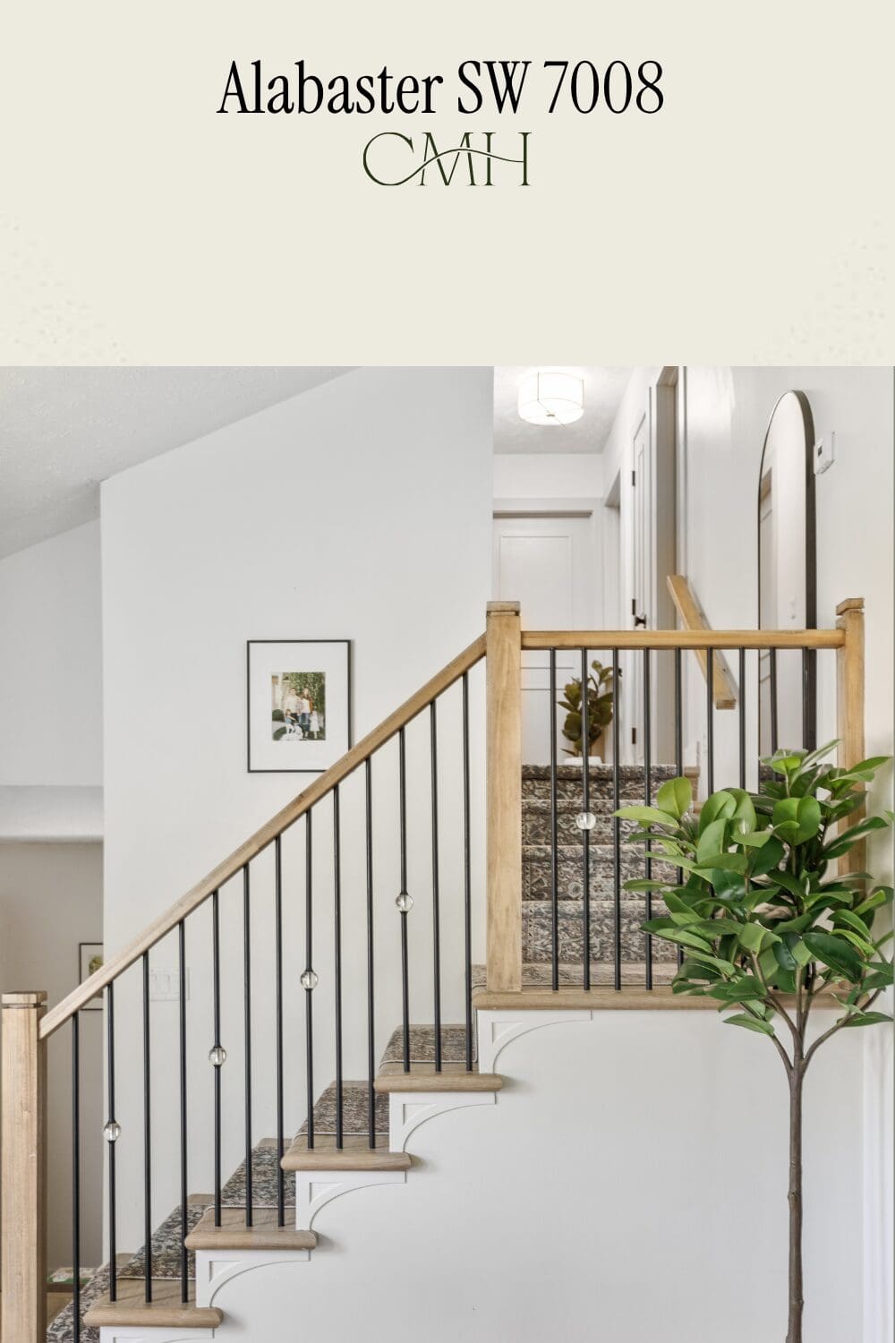
Every home needs a go-to white, and mine is Alabaster! This is not your stark, bright white. It’s a soft, warm white that feels clean and fresh without being cold or clinical. That warmth is exactly what makes it so versatile; it always looks polished and intentional. If you’ve been searching for the perfect white that works with warm neutrals and natural wood tones, this is the one!
Where I’ve Used Alabaster:
- Omaha
- Walls Throughout the Home
- Provo
- Home Exterior: DIY Black Window Grid Makeover That Totally Transformed My Home
- Upstairs Kitchen Upper Cabinets: The Best Kitchen Cabinet Paint and Easiest Way to Paint Your Kitchen
- Walls Throughout the Home: How to Build a DIY Board and Batten Wall in One Day
- Brick Fireplace: Painted Brick Fireplace With a DIY Wood Mantel
- Basement Mudroom: How to Build a Mudroom Storage Bench in One Weekend
Sherwin-Williams Gossamer Veil (SW 9165)
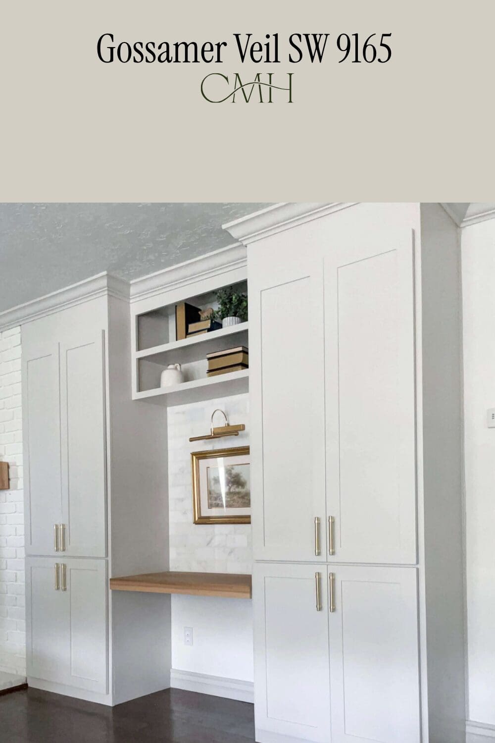
Gossamer Veil is one of those quietly beautiful colors that is so hard to put into a box! It sits right between grey and beige, giving it so much more depth and sophistication than a plain neutral. It’s calm, collected, and polished.
Where I’ve Used Gossamer Veil
- Provo
- Office Built-Ins: How to DIY Built-In Office Cabinets Part 2
- Doors and Trim: DIY Closet Shelves on a Budget: Step-by-Step Guide
- Mudroom Lockers: How I Built Custom Mudroom Lockers (And You Can Too!)
Sherwin-Williams Anew Gray (SW 7030)
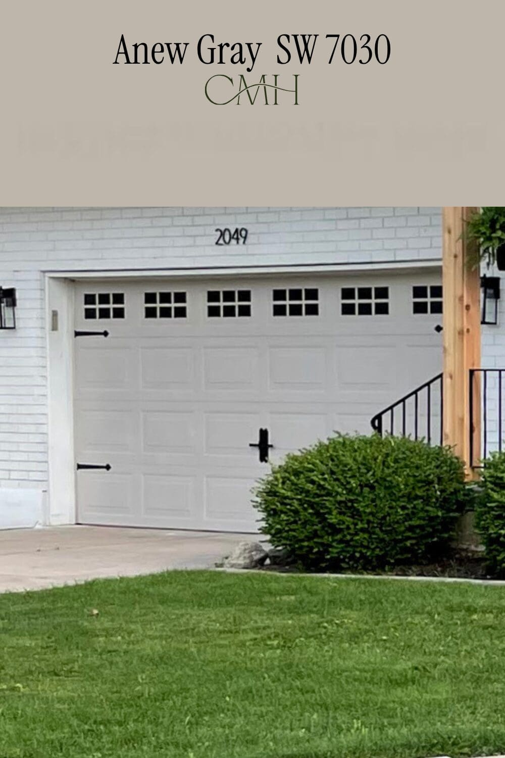
Anew Gray is one of those colors that is just so quietly perfect! I used it on the garage door and love how it adds just the right amount of contrast against the painted white (SW Alabaster) brick exterior. If you’re looking for a classic, timeless neutral that leans a little more grey than Accessible Beige, this is a great option!
Where I’ve Used Anew Gray
- Provo Garage Door
Exterior Cream (Custom Paint Color Match)
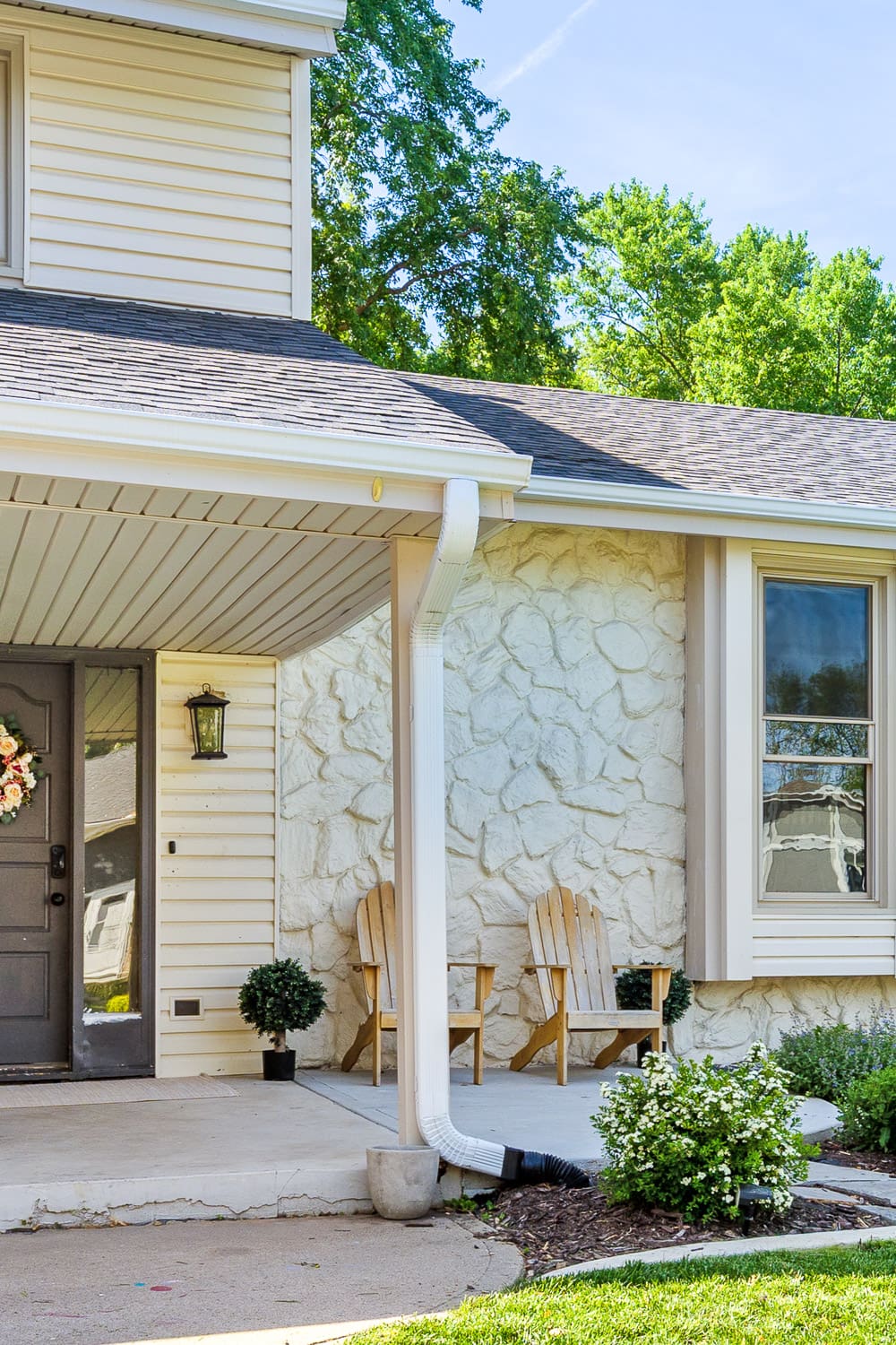
Sometimes the best design decision is knowing when to work with what you already have! When we updated the rock on the exterior of our Nebraska home, I didn’t want to repaint the whole house, so instead we took a sample of the existing paint to the store and had it color-matched. The result was this warm cream that ties everything together beautifully. I’m sharing the label so you have the exact formula.
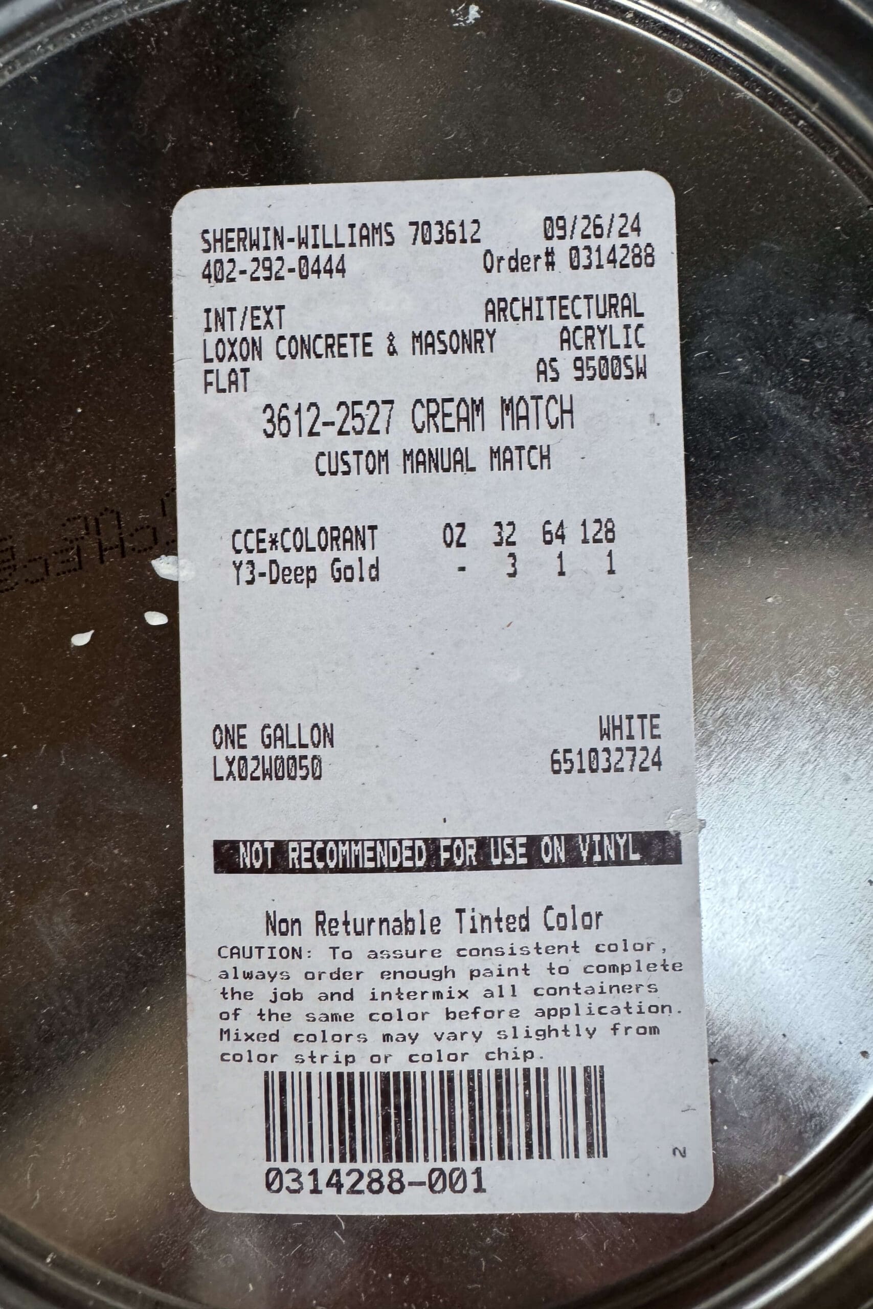
For the full post on how I updated the rock on the front of our home, and to see this color in action, go here: Updating My Ugly 1970s Exterior Rock Siding
The Best Dark Grey Paint Colors
Pale Iron Ore (Custom Paint Color)
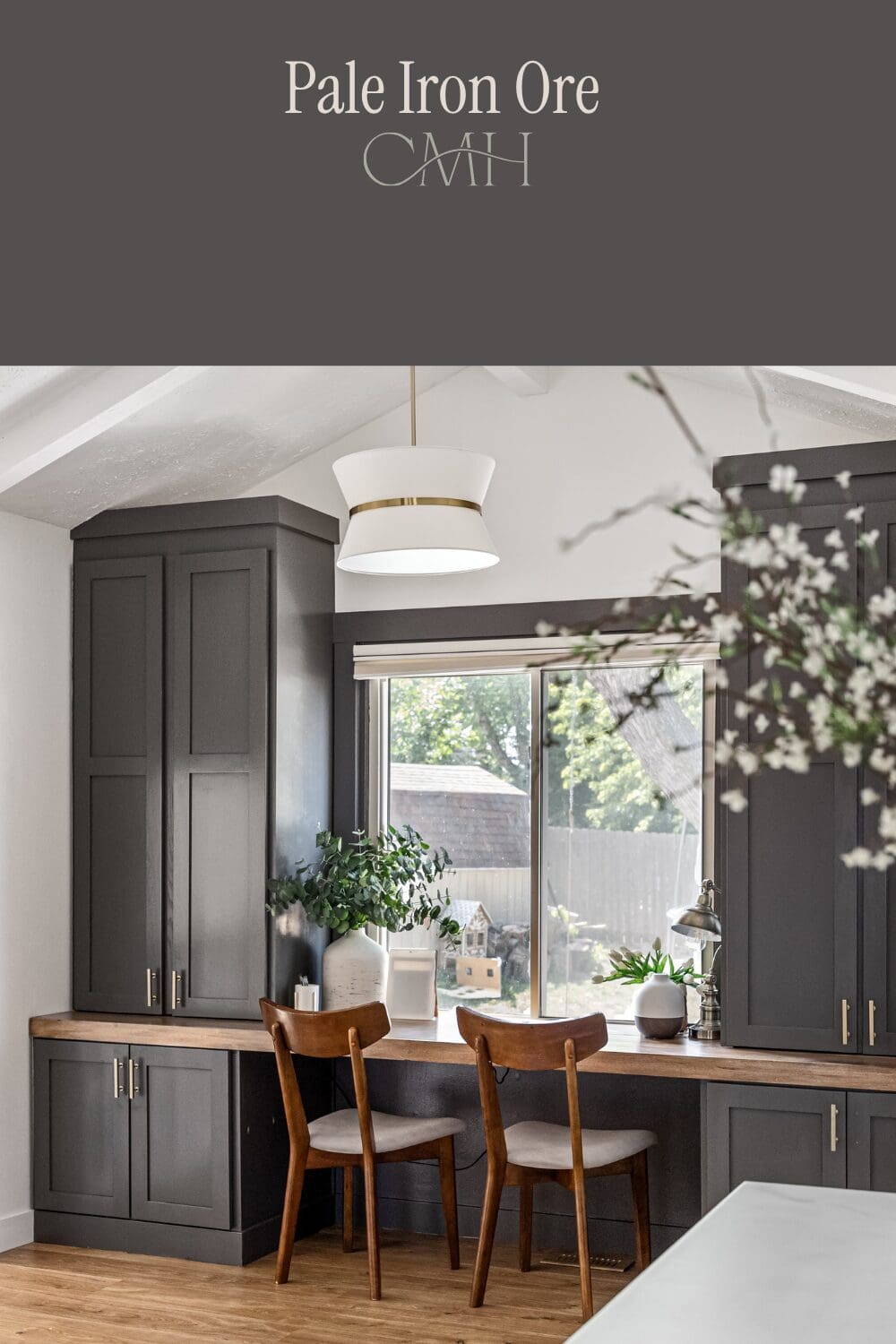
This one is a custom paint color, I used all over my home, we’re calling Pale Iron Ore! I wanted a deep, moody charcoal grey that felt sophisticated but not too dark or cold, and this custom blend is exactly that. It’s the kind of color that makes built-ins, cabinetry, and shelving look like they belong in a high-end design magazine. The best part? I’m sharing the exact formula so you can recreate it yourself. Just bring the label photo to your paint store, and they can mix it up for you!
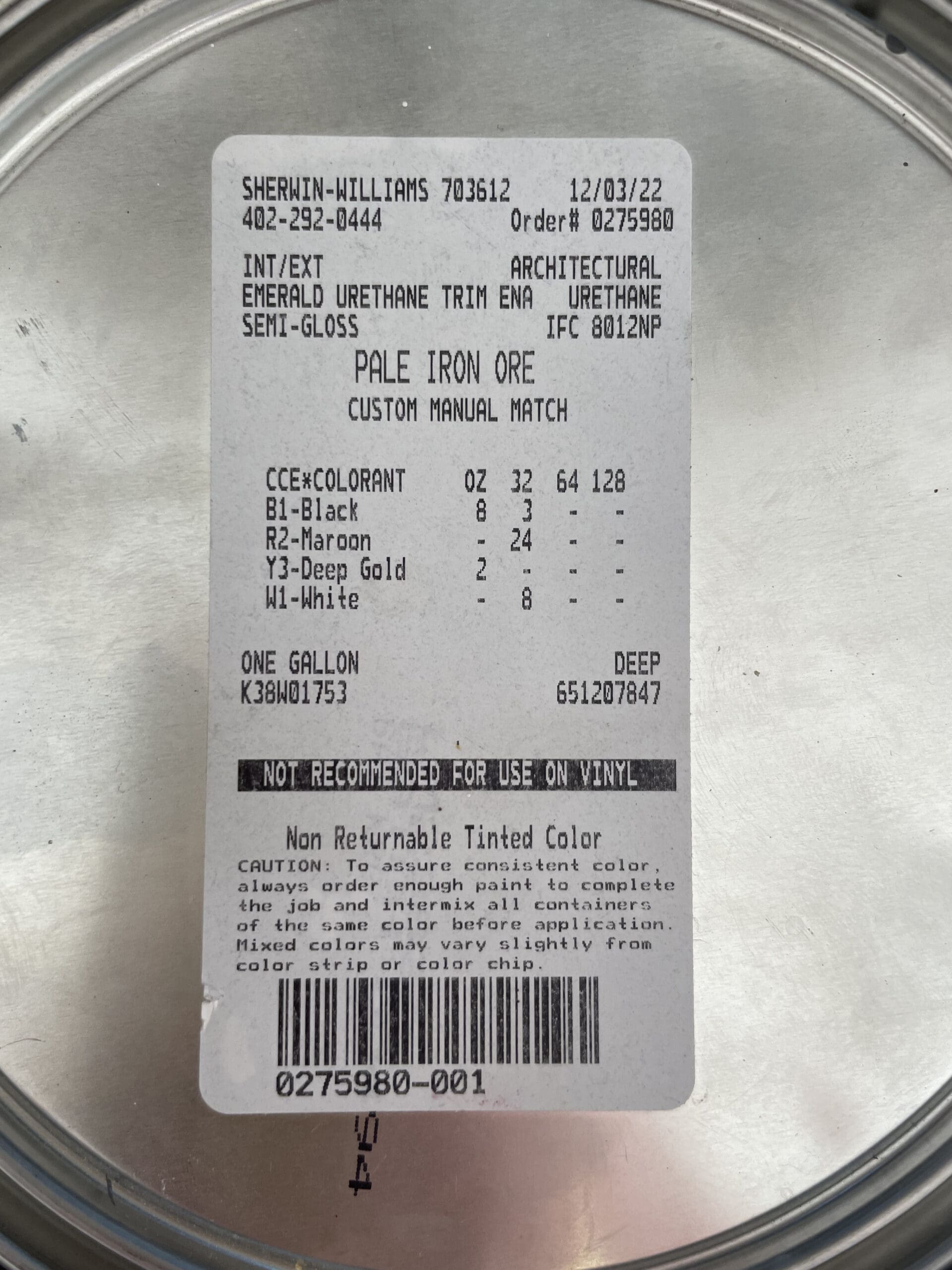
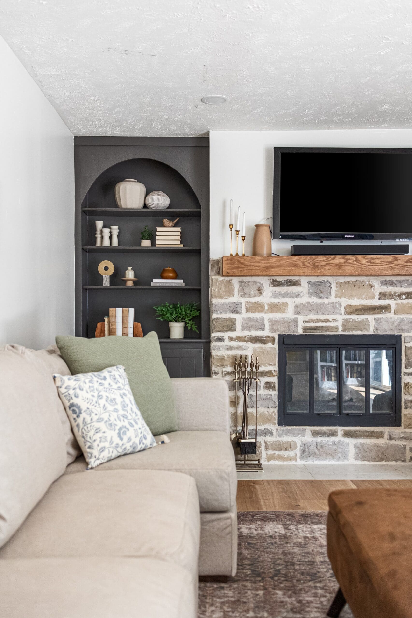
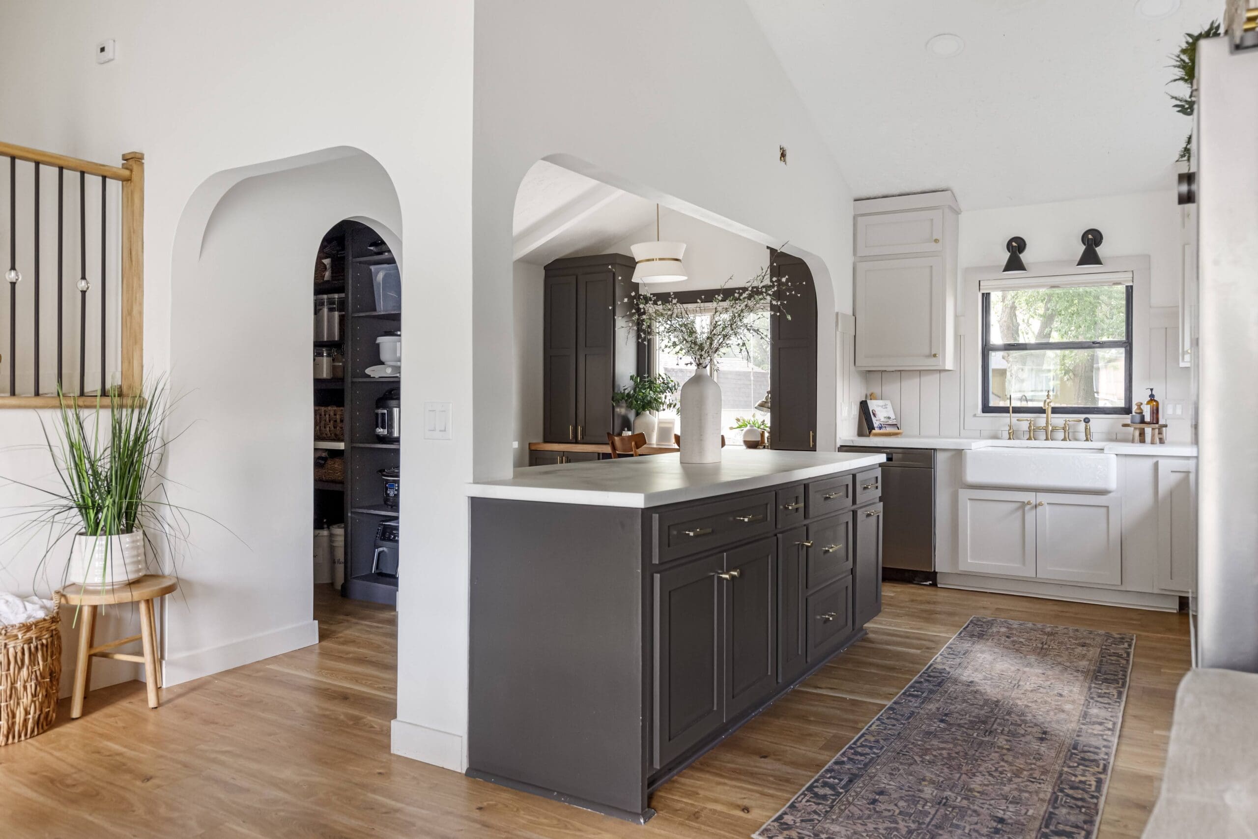
Where I’ve Used Pale Iron Ore:
- Omaha
- Living Room Arched Shelves: DIY Arched Living Room Shelves
- Front Door: How to Paint a Front Door in 3 Easy Steps
- Pantry: How to Build Beautiful DIY Pantry Shelves
- Kitchen Island: Affordable Kitchen Remodel Using Stock Cabinets and DIY Doors
- Home Office Built-Ins: Beautiful DIY Home Office Built Ins
- Backyard Shed
Sherwin-Williams Grizzle Gray (SW 7068)
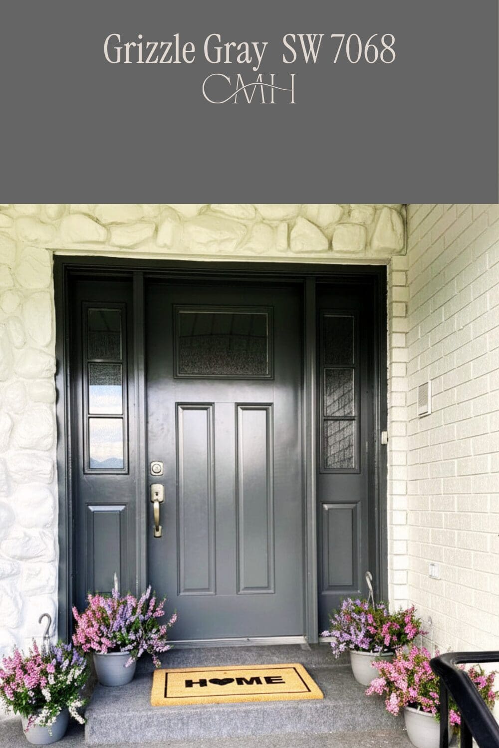
Grizzle Gray is a deep, moody charcoal grey that makes a serious statement! It’s dark enough to feel bold and dramatic, but still has enough grey in it to feel classic rather than stark. I used it on the front door of our Provo home and loved how it created such a striking contrast against the Alabaster white painted stone and brick exterior. If you want a front door color that makes a great first impression, this home paint color is a great choice!
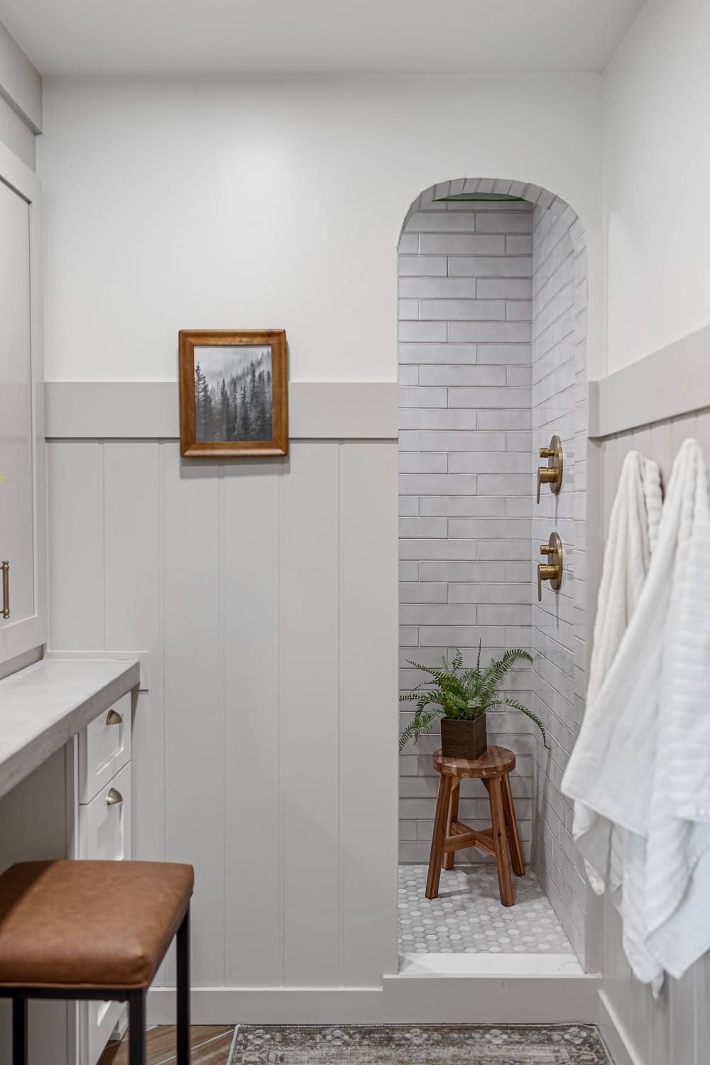
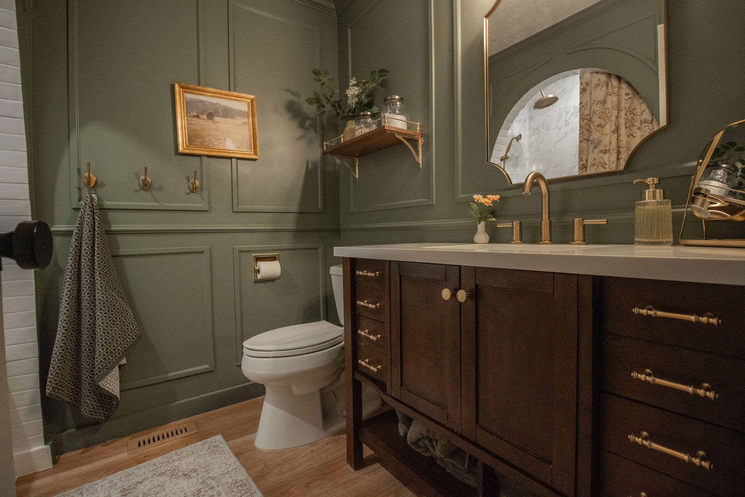
Sherwin-Williams Rock Bottom (SW 7062)
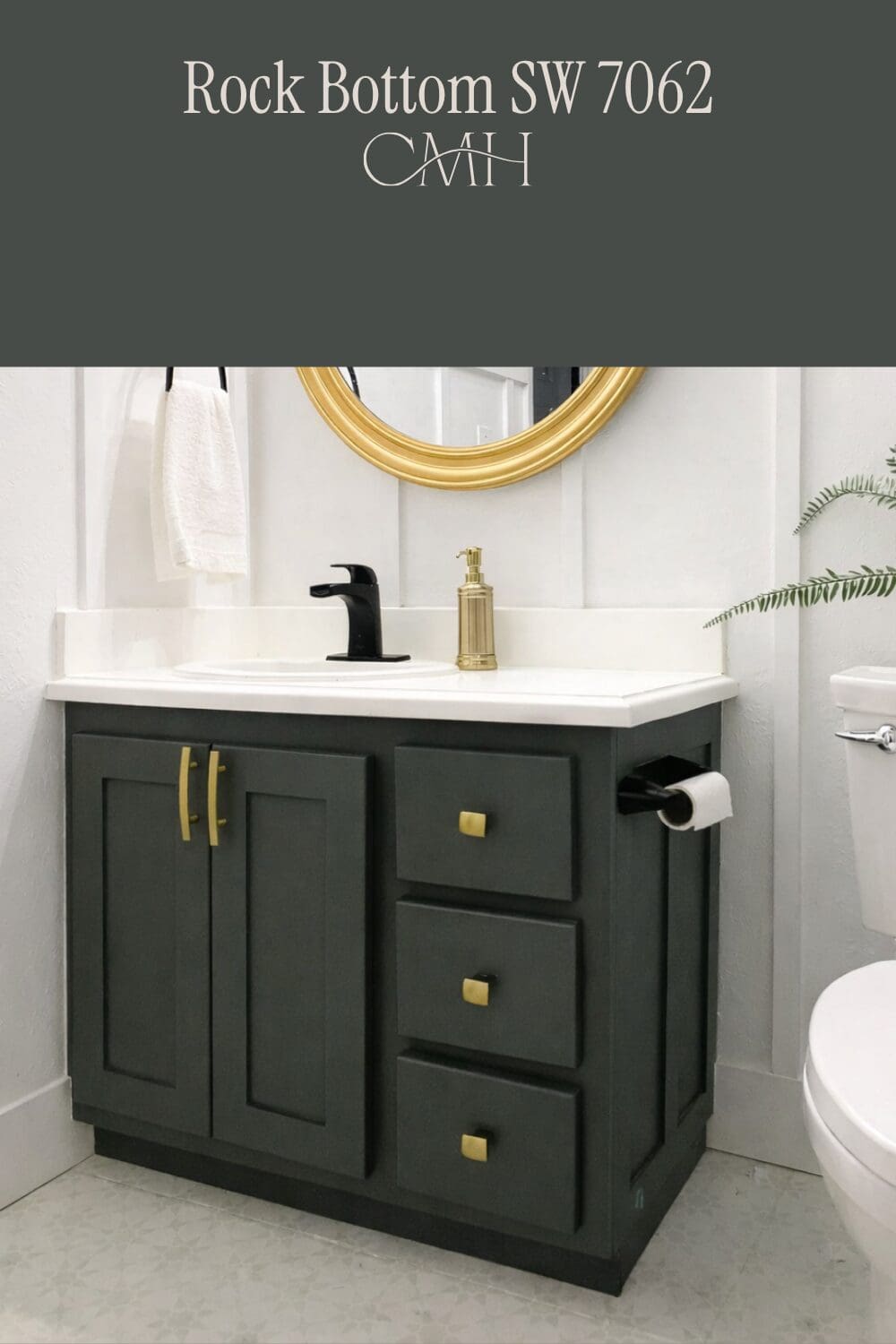
Rock Bottom is a deep, dark grey with just enough green undertone to keep it from feeling flat or cold. In person, it reads more grey than green, but depending on your lighting, it can shift slightly either way, which is part of what makes it so interesting! I used it on the vanity in our Provo basement bathroom and love how dramatic and moody it looks against the white walls and board and batten. For all the DIY tutorials in this bathroom, check out this post: DIY Small Bathroom Remodel on a Budget
All My Favorite Green Paint Colors
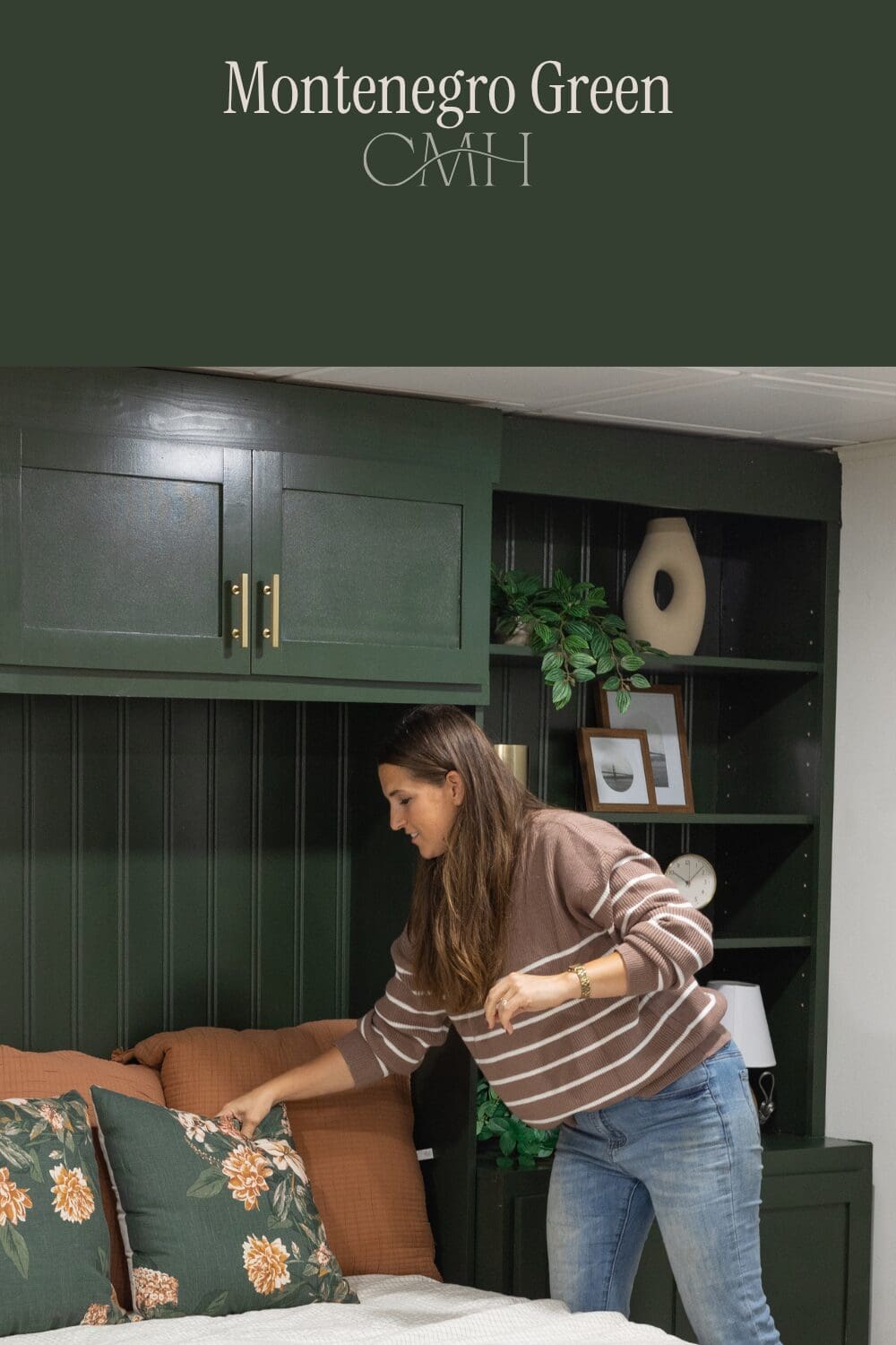
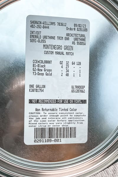
Montenegro Green (Custom Paint Color)
Montenegro Green is a deep, rich forest green that feels both bold and timeless at the same time. This paint color will be gorgeous in your home. It’s the kind of color that completely transforms a space and makes built-ins and cabinetry look like they were professionally designed. I love how it pairs with gold hardware. Just like Pale Iron Ore, this is a custom color match, so I’m sharing the label so you can take it to your local paint store and have it mixed up for yourself!
Where I’ve Used Montenegro Green:
- Powder Room Walls: DIY Bathroom Walls With Beadboard Upgrade
- Basement Murphy Bed Built-Ins: DIY Built-in Murphy Bed With Bookshelves (And How I Styled Them!)
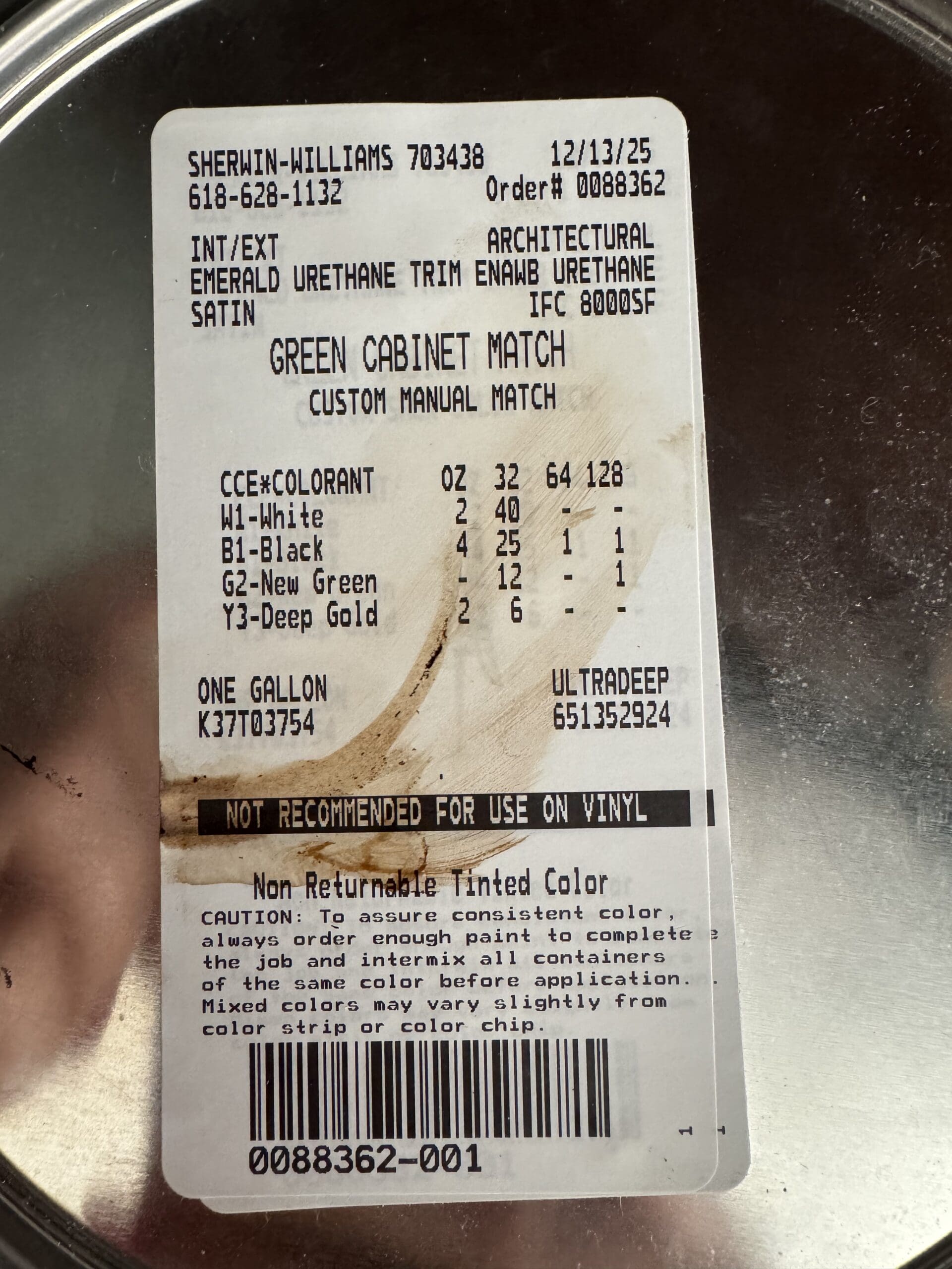
Sherwin-Williams Pewter Green… Almost! (Custom Color Match)
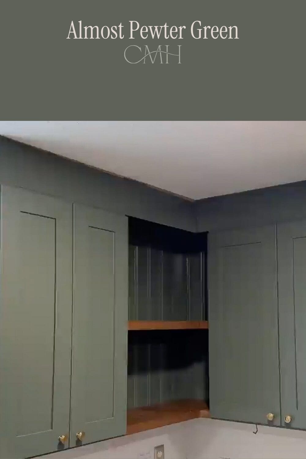
This one comes with a fun story! When we started remodeling the kitchen in our current home in St. Louis, the kitchen cabinets were from a local cabinet maker who wouldn’t reveal their paint color, but did tell me it was a Sherwin-Williams color. So I did what any paint-obsessed person would do… I bought the entire set of Sherwin-Williams paint cards and matched it myself to Pewter Green. But when I got an actual paint sample, the enamel finish the cabinet maker used made the color read completely differently, so it wasn’t quite right. I ended up taking a cabinet door into the paint store for a color match, and that is the color I’m sharing with you today!
Benjamin Moore Intrigue (BM 1580)
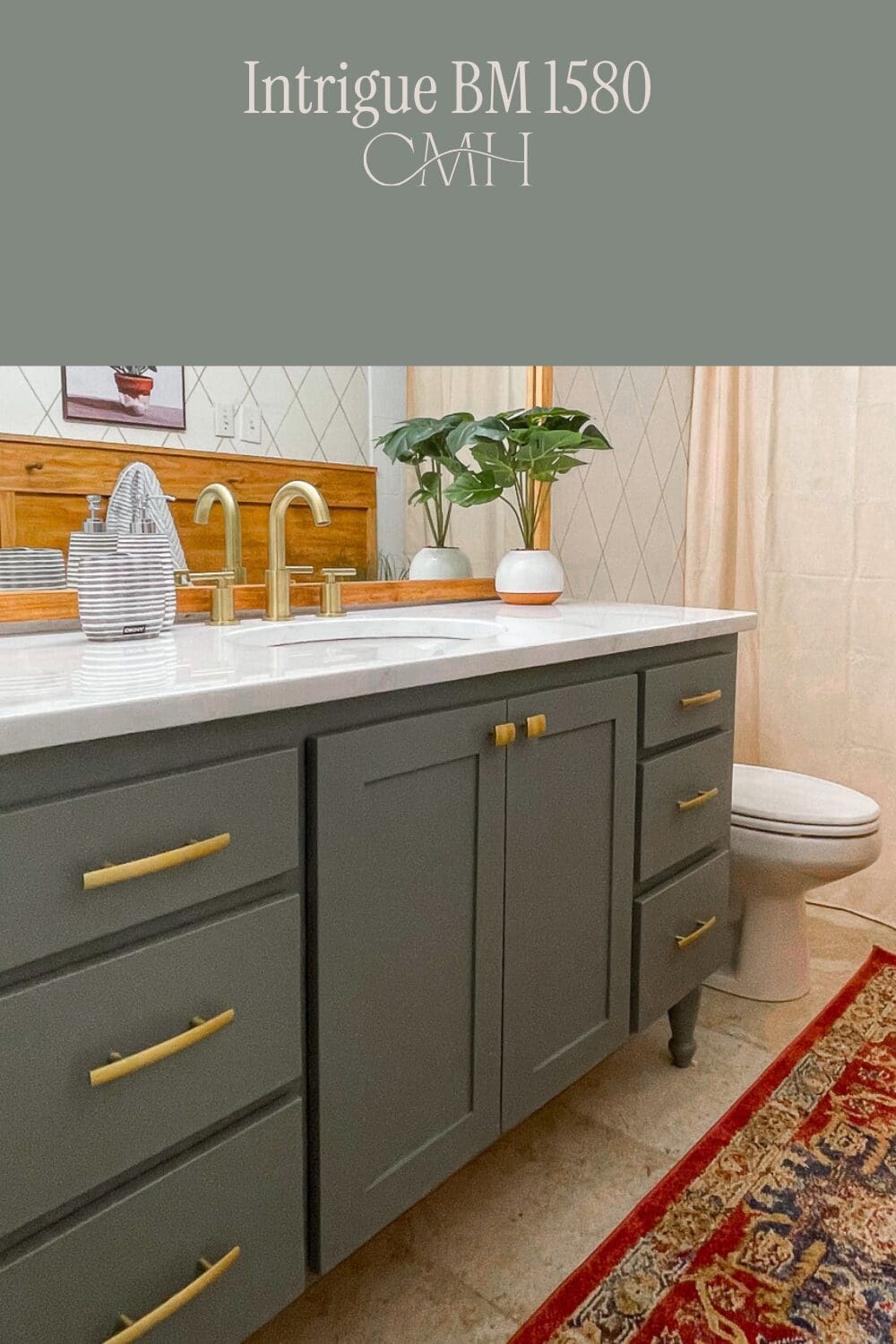
Intrigue by Benjamin Moore is a gorgeous, deep grey-green that I used on a bathroom vanity in our Provo home, and I absolutely loved the result. It has the moody, sophisticated quality that I’m drawn to in my greens, but with a cooler, more grey undertone that makes it feel really polished. It pairs beautifully with gold hardware and white countertops, and the name really does say it all; it’s just an intriguing, complex color that is hard to look away from!
Sherwin-Williams Dried Thyme (SW 6186)
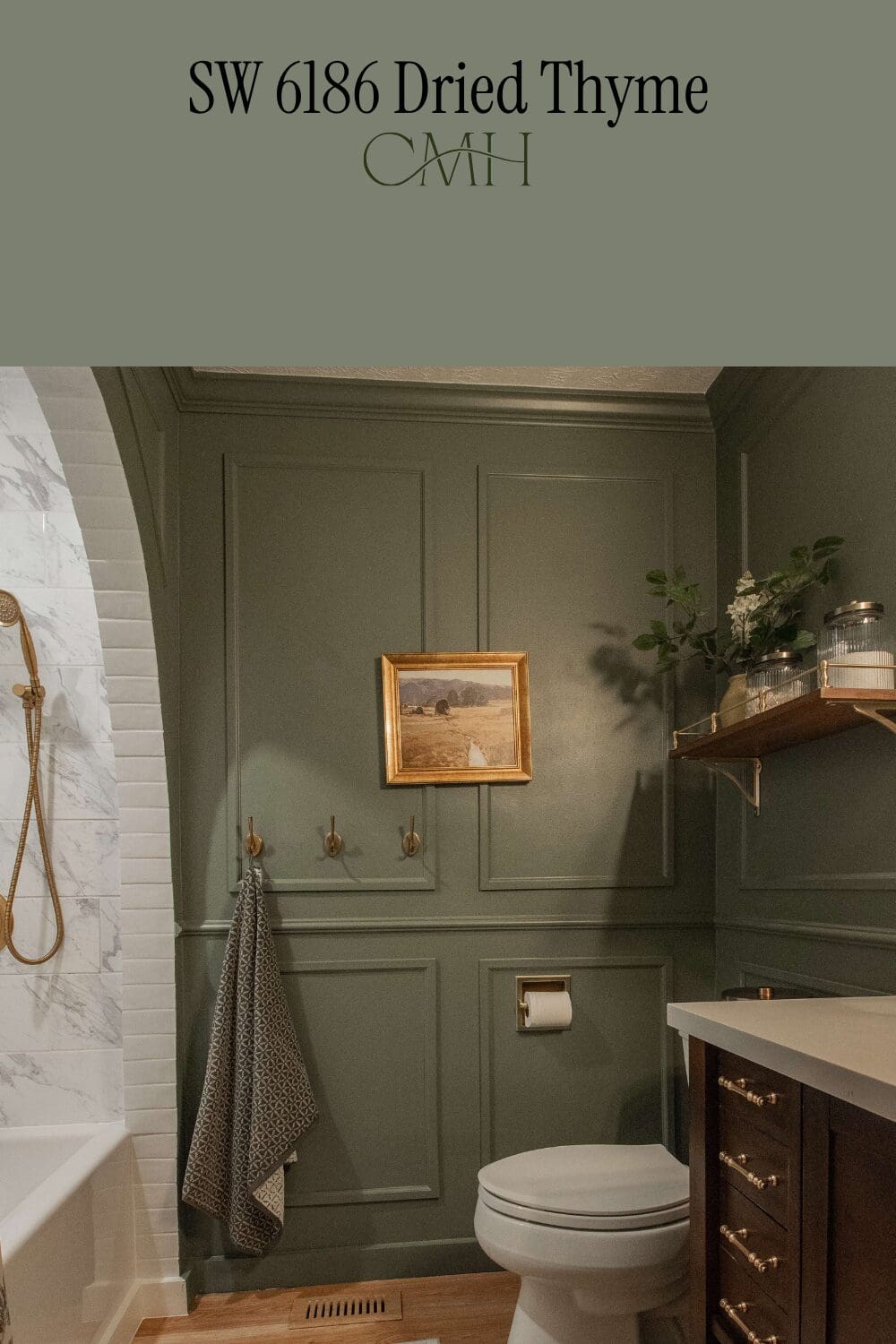
If you’ve ever dreamed of a bathroom that feels like it belongs in a boutique hotel, this is the paint color that makes it happen in your home! Dried Thyme is a beautiful muted sage green that is warm, sophisticated, and incredibly elegant. I used it in the guest bath in our Omaha home, and it completely transformed the space. Paired with gold hardware and crown moulding details, this color just sings. It’s the perfect green for anyone who wants to add some color to a space without it feeling too bold or overwhelming.
There are so many good DIY projects in this gorgeous bathroom. For all the details, check out the full post here: DIY Dark Green Bathroom Remodel: Complete Guide
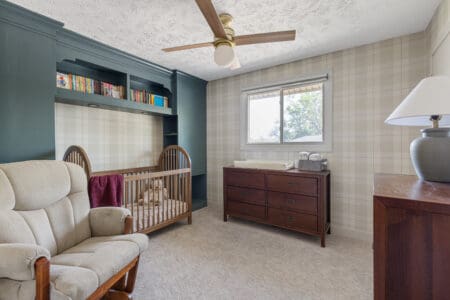
Sherwin-Williams Mountain Pass (SW 9655)
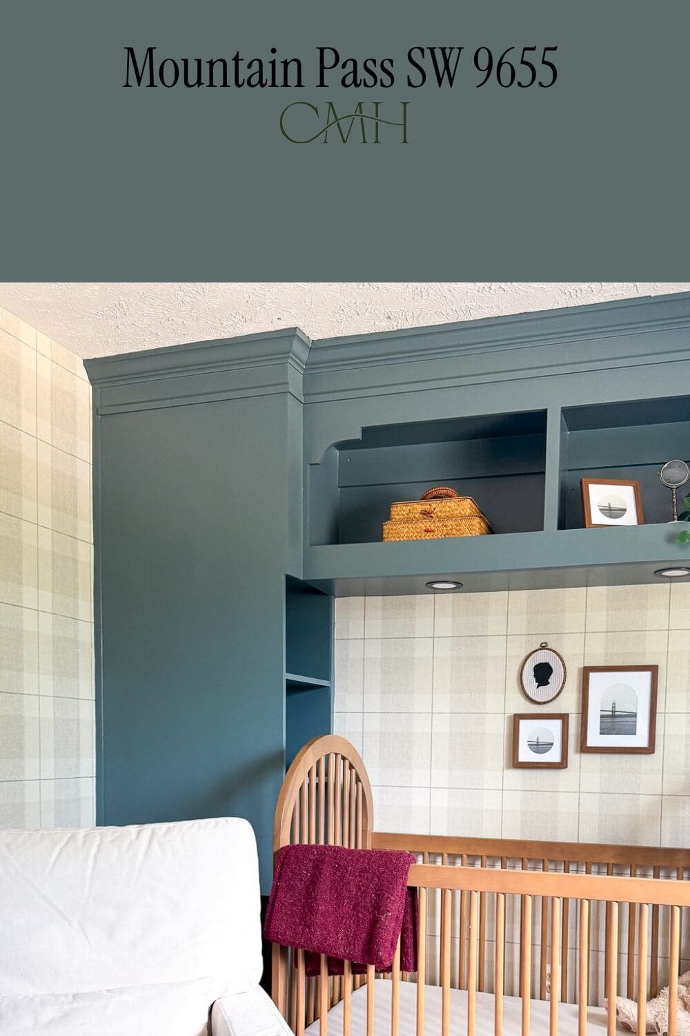
This paint color sits right in that beautiful, sweet spot between green and blue! When designing my son’s nursery in Omaha, I wanted a moody, saturated color for the custom bed surround to contrast with the tan and off-white plaid wallpaper. I tested out several greens and blue-greens before landing on Mountain Pass. The cool teal tones played off the warm tones in the wallpaper perfectly! For the full details on this bedroom, go here: DIY Headboard with Storage (That Looks Built-In!)
How to Get a Professional Paint Finish
The right paint color is only half the battle. The finish and application method matter just as much! If you’ve ever wondered how I get that smooth, professional-looking finish on my cabinets, shelving, and furniture, I’ve shared everything in my post The Ultimate Guide to Painting Cabinets & Furniture. It covers all my tips and tricks so you can achieve the same results at home!
Happy Painting!
Paint truly is one of the most powerful and affordable ways to transform a space, and I hope this list inspires you to pick up a brush! Whether you’re drawn to the warm neutrals, the moody greens, or one of the custom colors, I can’t wait to see what you create. I’ll do my best to keep this post updated as I tackle new projects and fall in love with new colors, so bookmark this page and check back often. As always, feel free to leave any questions in the comments below!
📌 Save These Home Paint Colors on Pinterest!
If you found this post helpful, don’t forget to save it to your Pinterest boards so you can find it again later!
Frequently Asked Questions on Home Paint Colors
It’s easier than you think! Simply take the photo of the paint can label to your local Sherwin-Williams store and show it to the associate. The label includes the full color formula, and they can mix it up for you on the spot.
Not always, and that’s completely normal! Paint colors can look different depending on your lighting, the direction your room faces, and even the other colors and finishes in the space. I always recommend grabbing a sample and testing it on your wall before committing to a full gallon. What looks one way in my home may read slightly different in yours!
I typically do two coats, depending on the color and surface. Always let each coat dry completely before adding the next!
For walls, I typically use an eggshell finish, and for cabinets, furniture, and built-ins, shiplap, etc. I always use a semi-gloss or satin. The higher sheen on cabinets and furniture makes them much easier to clean and gives them that beautiful, polished look!
